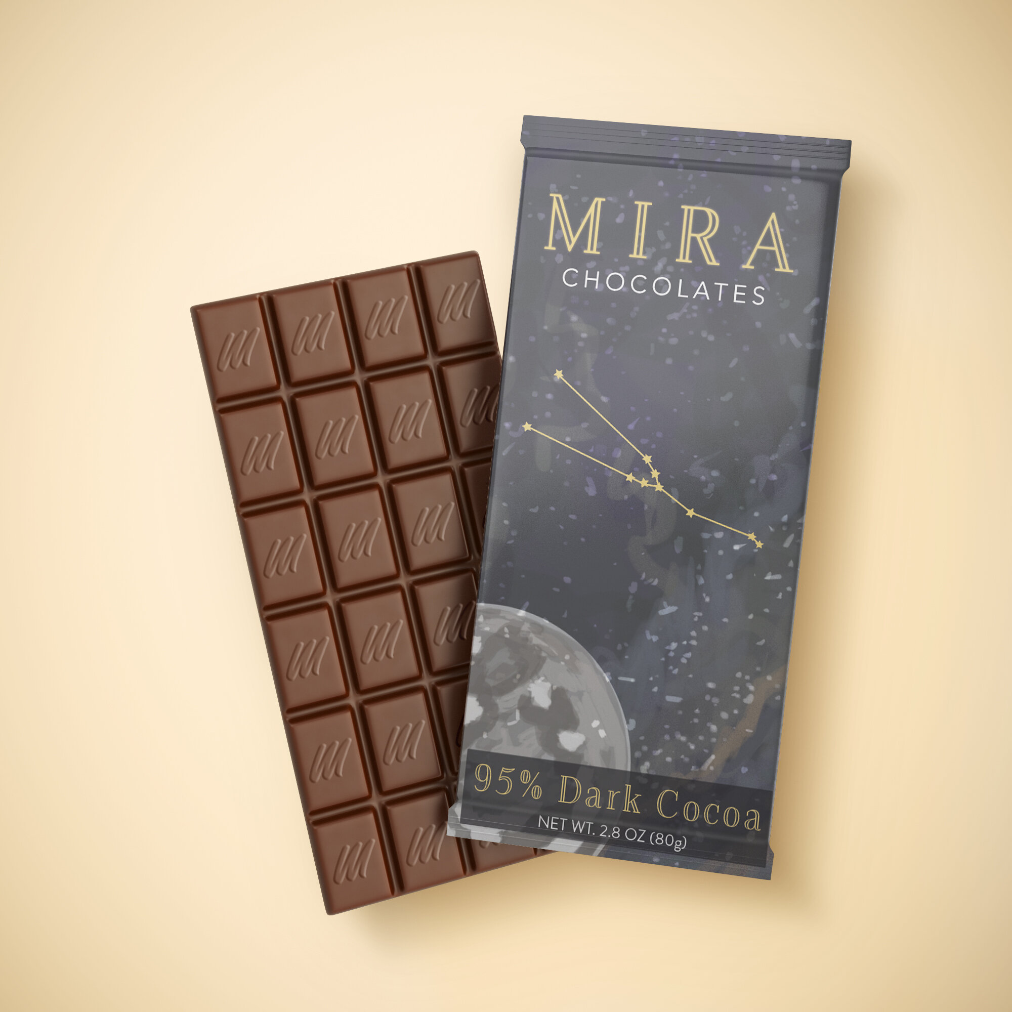
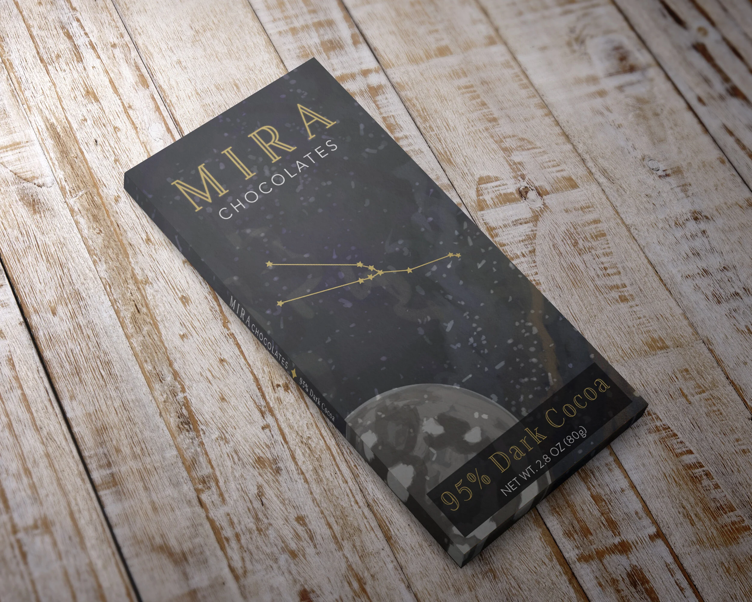
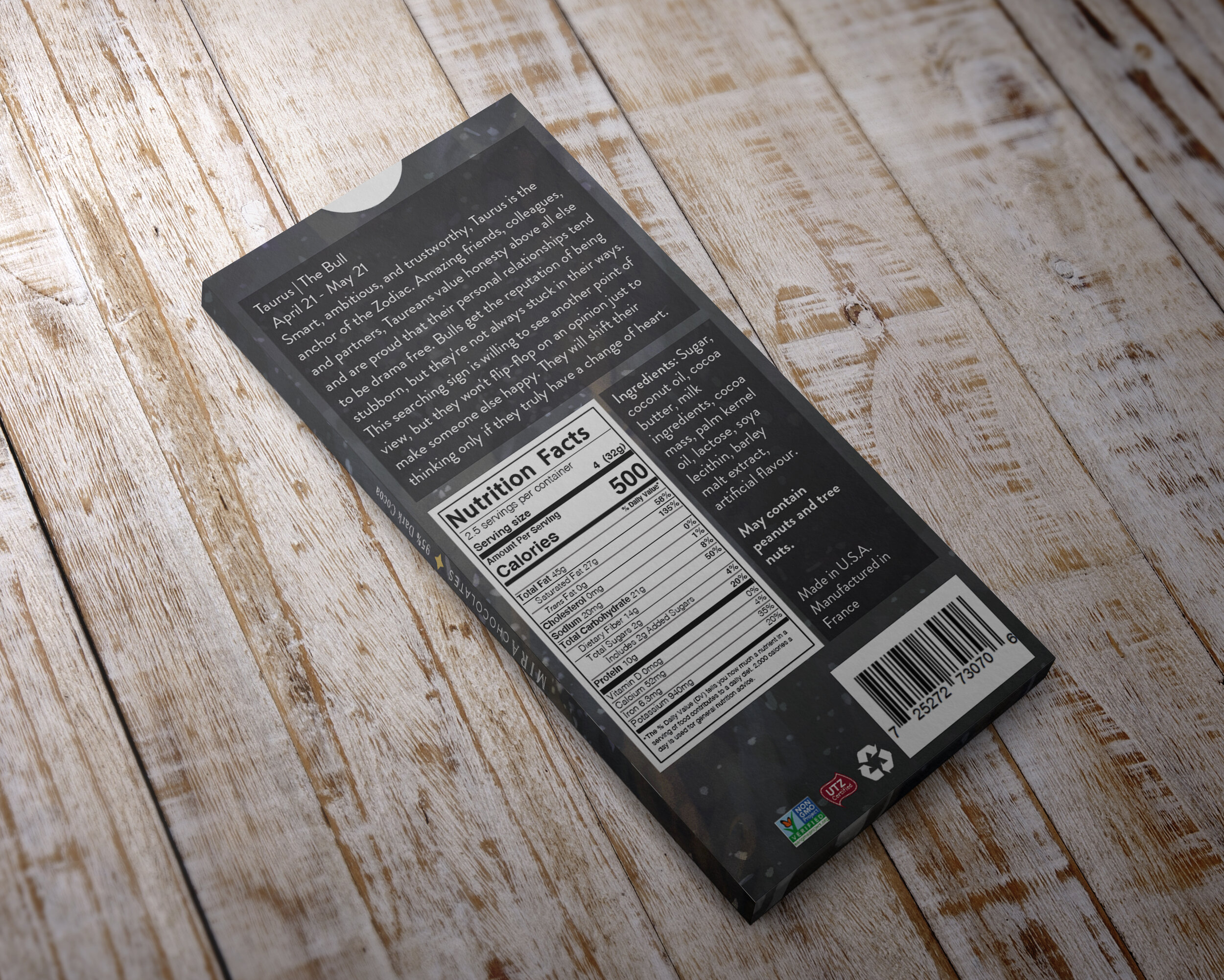
Mira Chocolates
ILLU 318 | Type & Image
Branding | Package Design | Print Design
Mira is a chocolate company that makes constellation based packagings. The name Mira comes from a solar stargazing system NASA uses. The design style is more illustrative with a painterly aspect of it.
The Objective
Create a package design for a food item while integrating illustration. The product must also have a logo that represents the concept.
Typeface:
Packaging: Azote, Brandon Grotesque
Software:
Adobe Illustrator, Photoshop
Dimensions:
Packagings (8.15”x9.52”)